Cremona Studios is an innovative brand led by Dina Wassef, a visionary woman dedicated to empowering women through the intersection of health coaching and fashion design. With a deep understanding of the importance of well-being and personal style, Cremona seamlessly merges these two realms to create a unique experience for women worldwide.


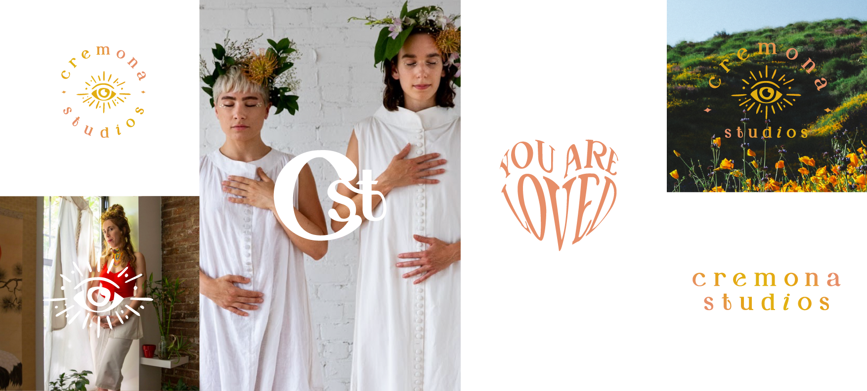
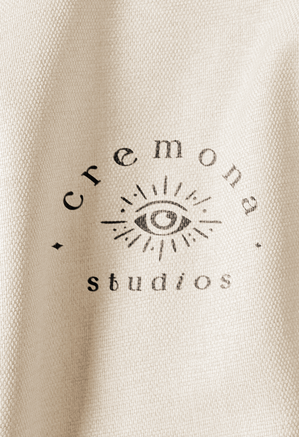
In addition to the inspiring fusion of health coaching, fashion design, sustainability, and organic fabrics, Cremona Studios is also distinguished by its captivating logo. The brand's visionary founder, with an astute eye for symbolism, crafted a logo that embodies the essence of awareness and enlightenment. At the heart of the logo lies an open eye, serving as a powerful representation of awakening and consciousness.
This eye of awareness symbolizes the transformative journey that Cremona Studios embarks upon with each woman who engages with the brand. It signifies the brand's commitment to fostering personal growth and empowering women to embrace their authentic selves.
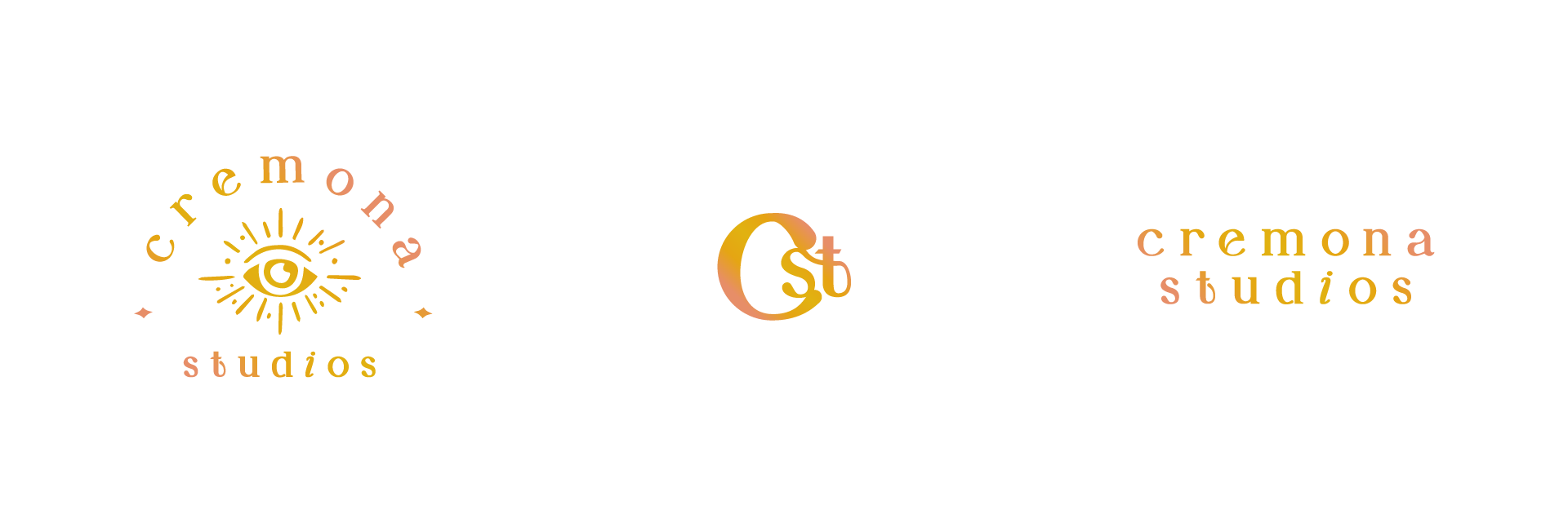
Cremona Studios boasts a dynamic branding strategy designed to serve the purpose of transformation. The brand understands that personal growth is a journey, and its multifaceted approach is reflected in a series of sub-logos that encapsulate different aspects of this transformative process.

To further amplify the logo's impact, vibrant and bright colors were carefully chosen. These hues radiate energy and vibrancy, evoking a sense of joy, positivity, and enlightenment. The use of such colors not only captures attention but also serves as a visual reminder of the brand's uplifting mission and its ability to inspire and invigorate.

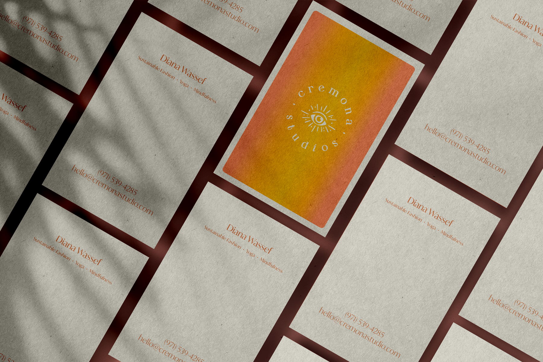
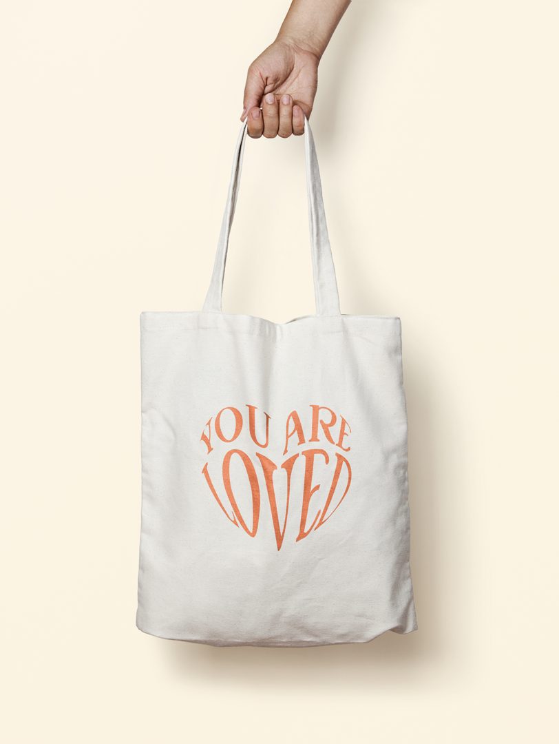
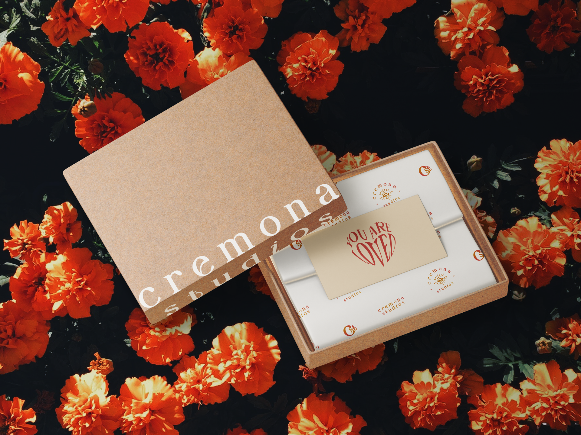
The use of these sub-logos extends across different touchpoints, such as social media, packaging, and promotional materials. This cohesive and thoughtful branding approach creates a consistent visual language that resonates with the brand's target audience, reinforcing the message of empowerment and transformation at every interaction.