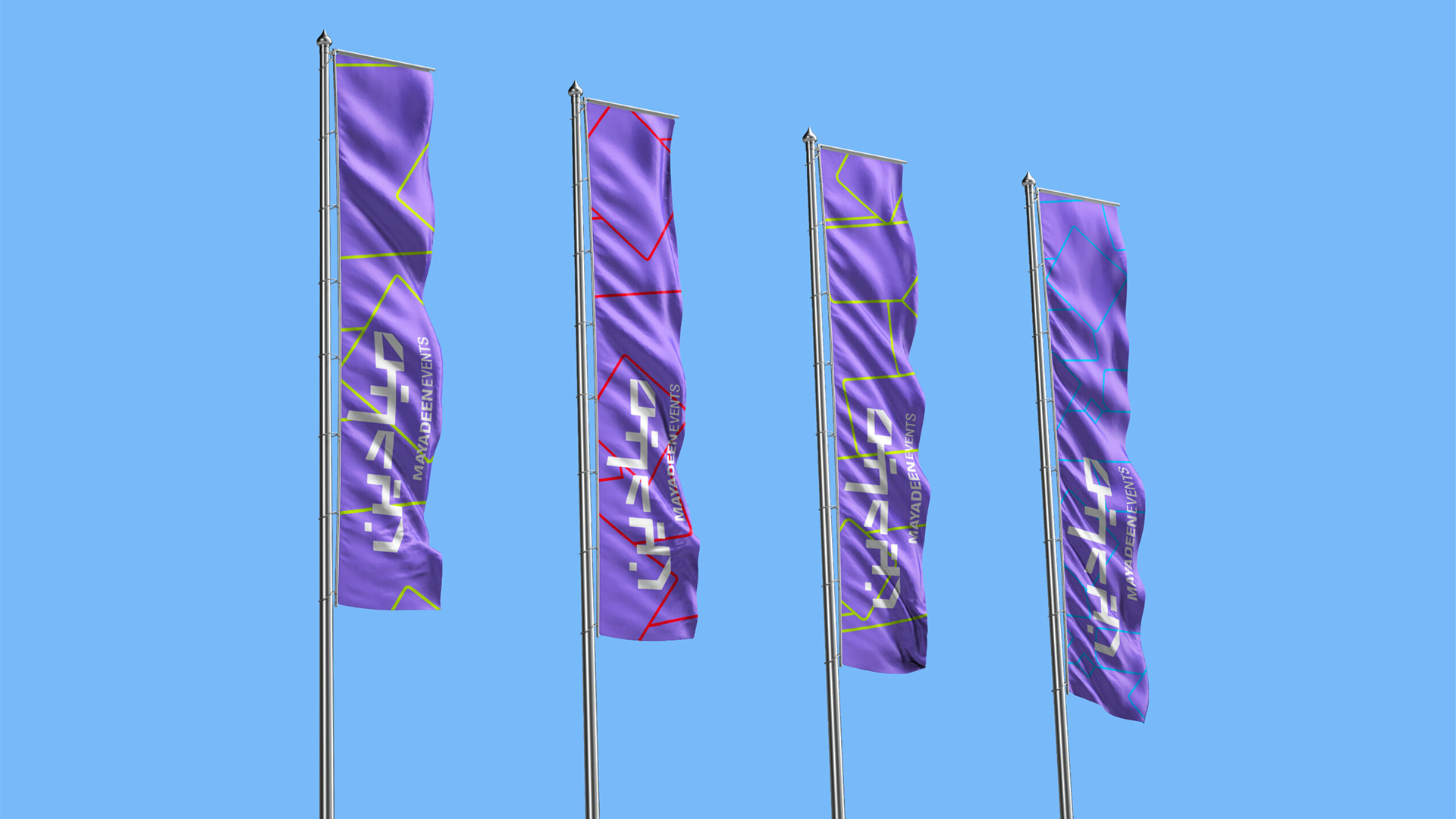
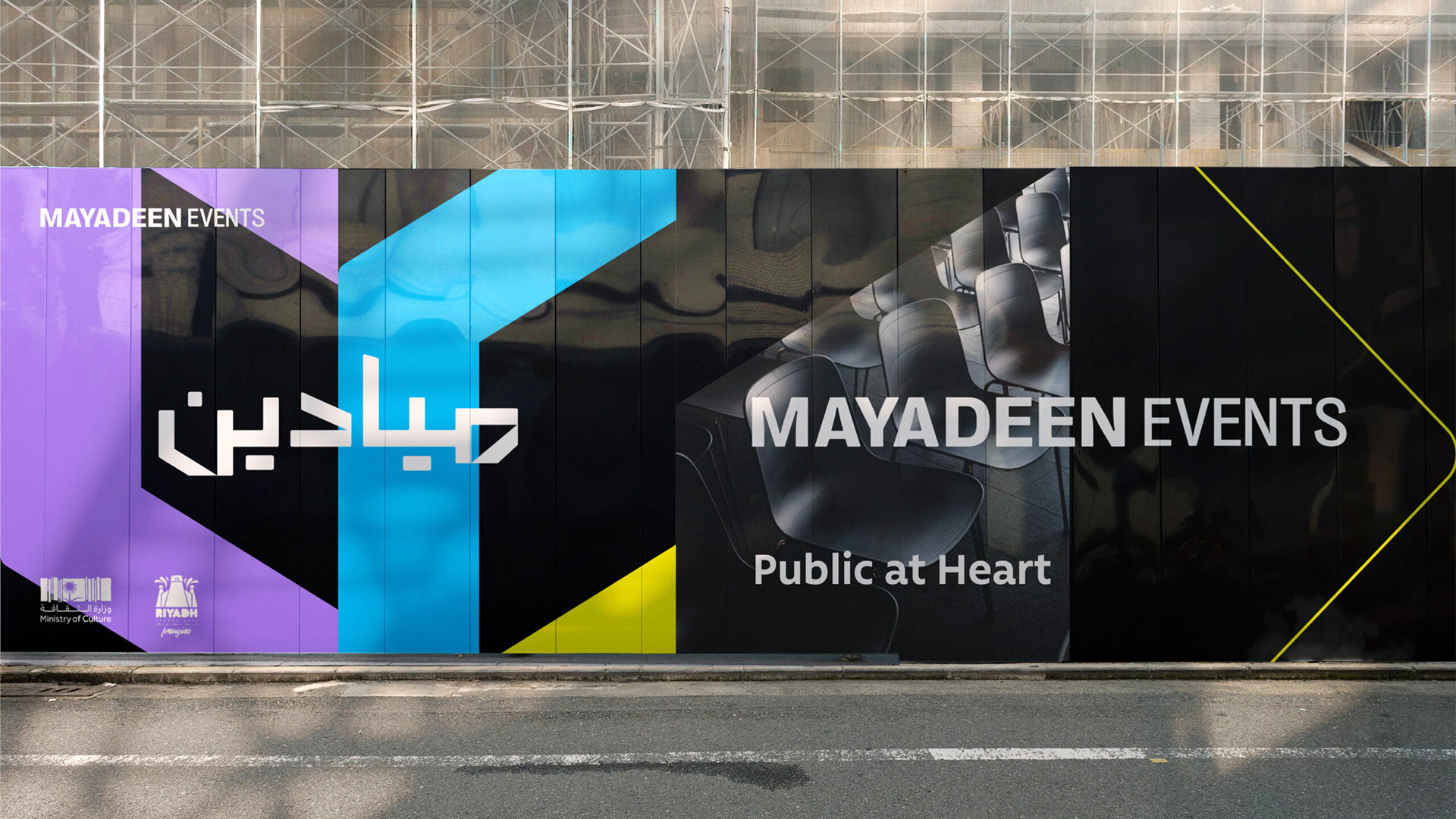
MAYADEEN
Branding experience for an event innovation company.
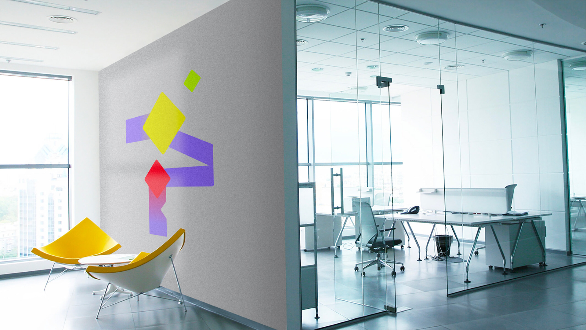
The branding visualizes the spaces that an event creates combined with the rush of emotions produced by being at the heart of the moment.
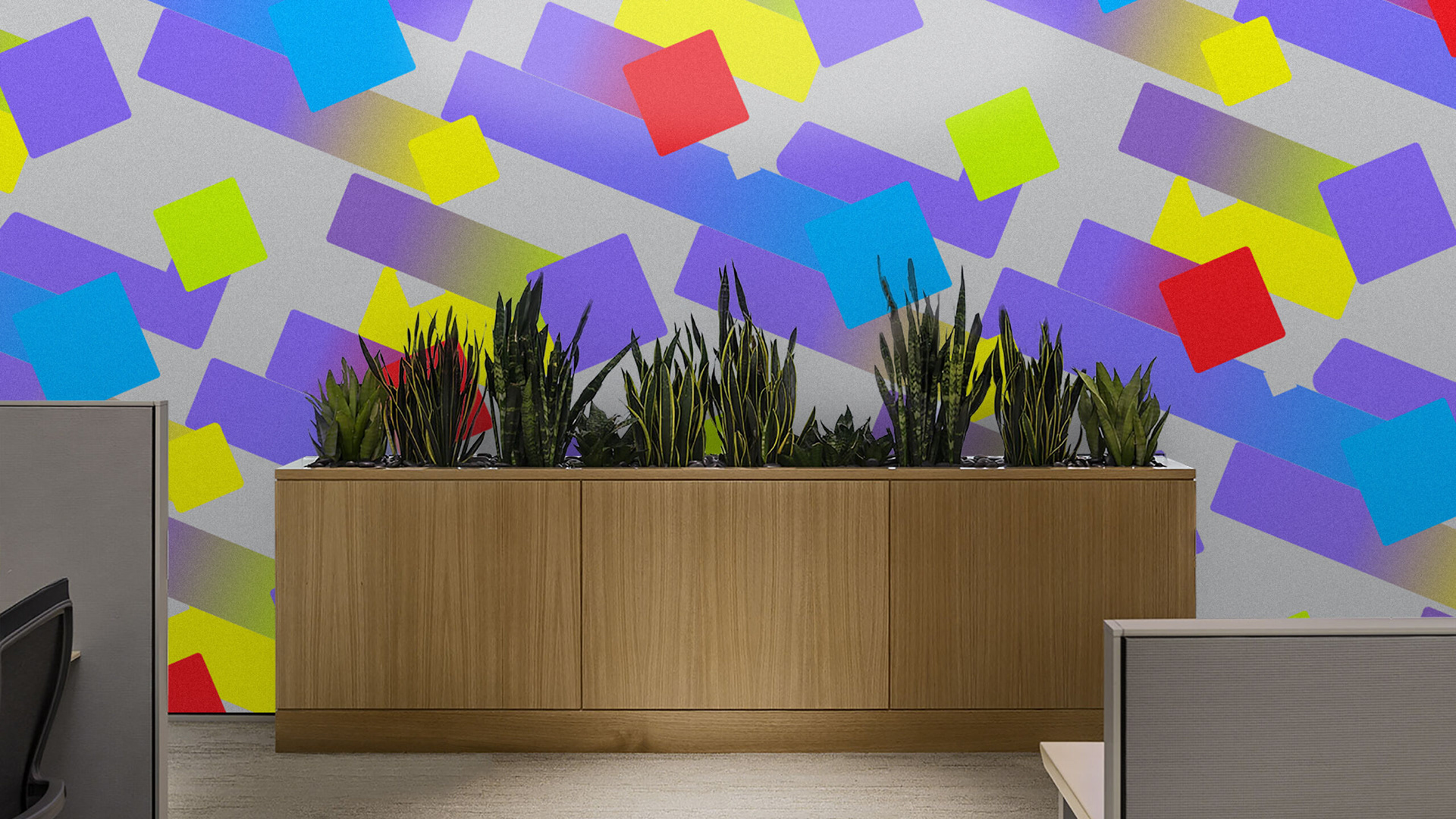
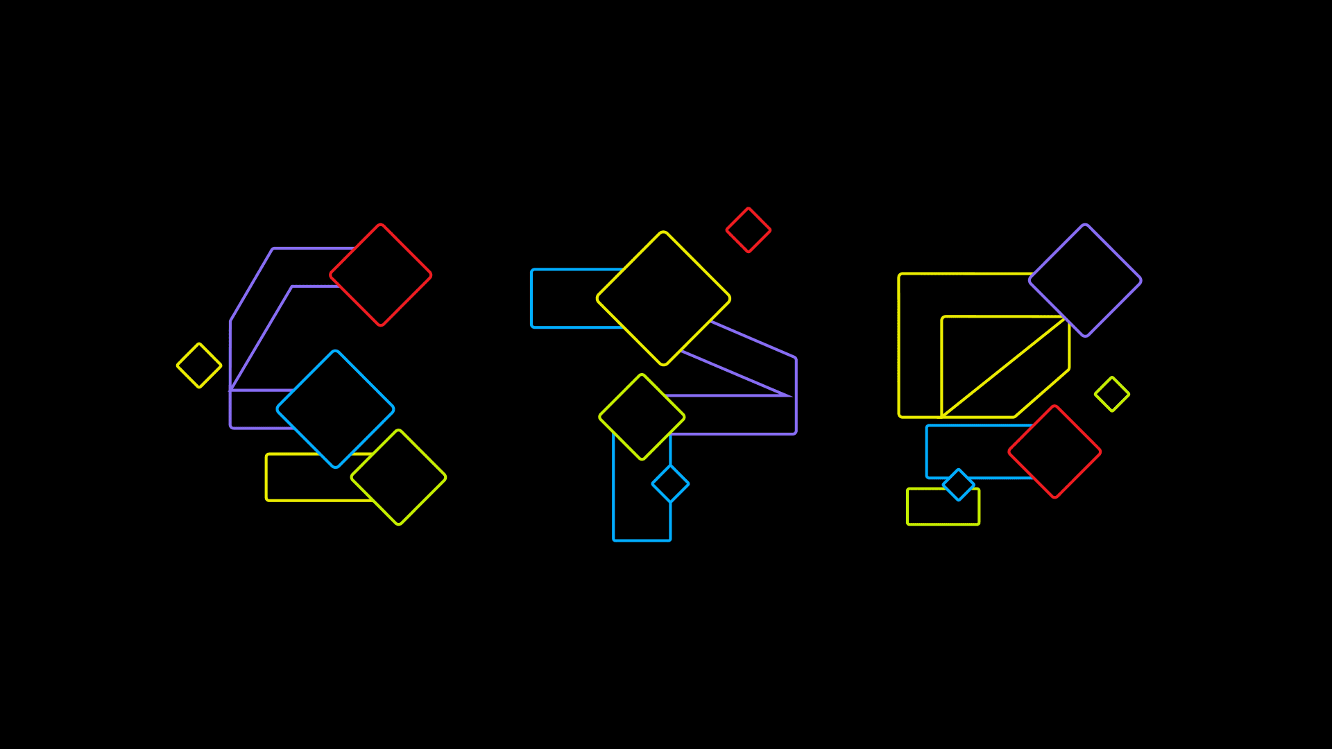
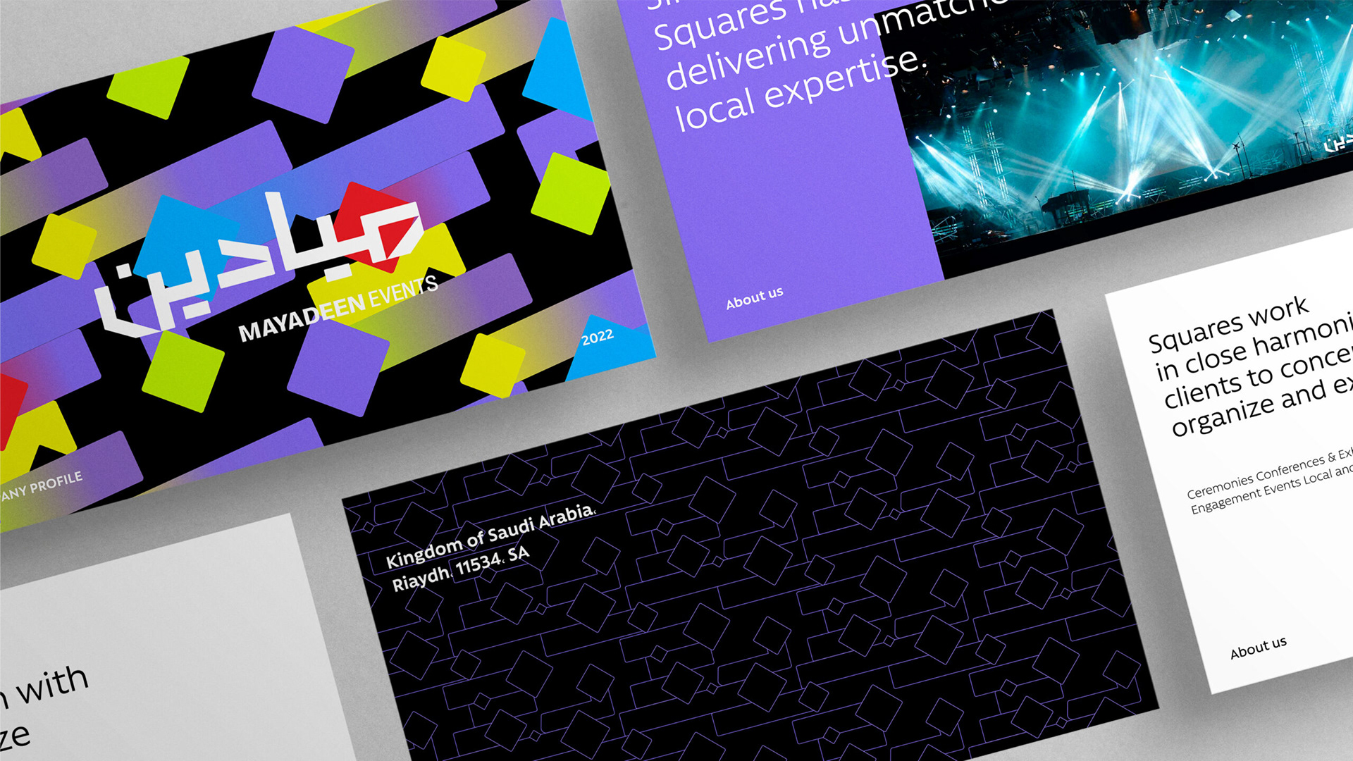
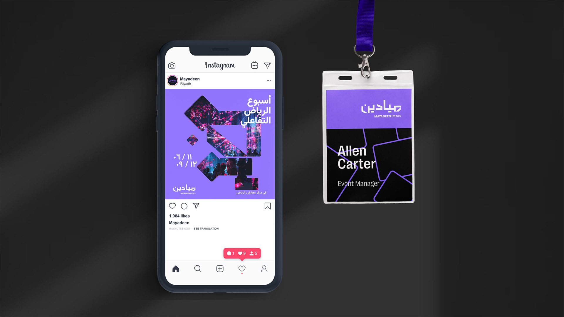
A custom-constructed type font draws the logo spatially, denoting the “Maydan” the physical location that hosts an event. The dynamism of the triangulation moves the logo to the edge needed to produce youth-oriented music concerts, giving the brand image a music label edge.
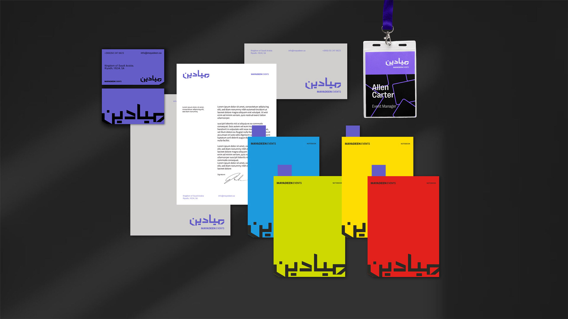
The violet color is a nod to the old branding, while a black and white contrast primary colors to create an electrifying feel across the branding, permitting it to roar like a concert and tone down into cultural events when needed.
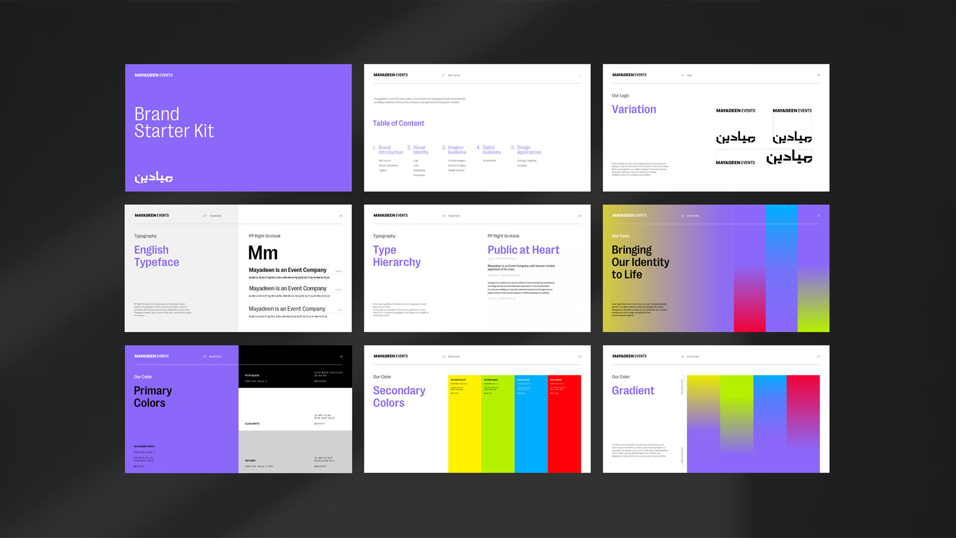
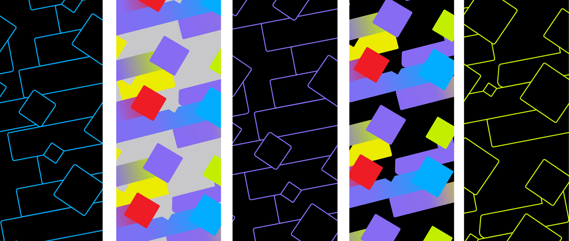
A modular pattern was designed to work across multiple functions, including motion design and a visual placeholder for posters.

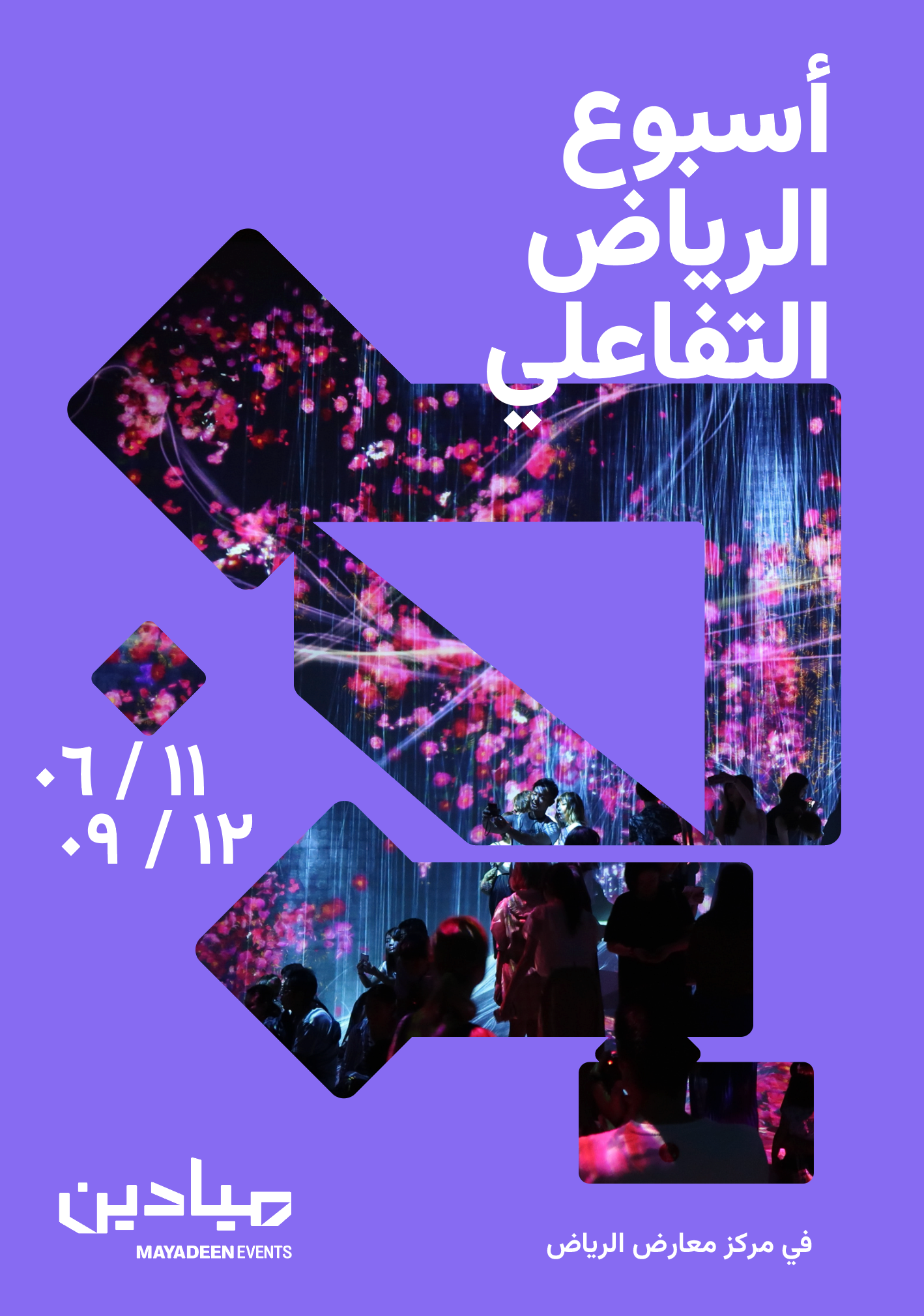
The result is a brand that physically constructs itself as it grows.