After a decade of operation, the brand needed to expand beyond the neighborhood shop and spread the connection with the entire expat community looking for a taste of home.
The challenge was to expand and mature the branding without loosing the decade of history.
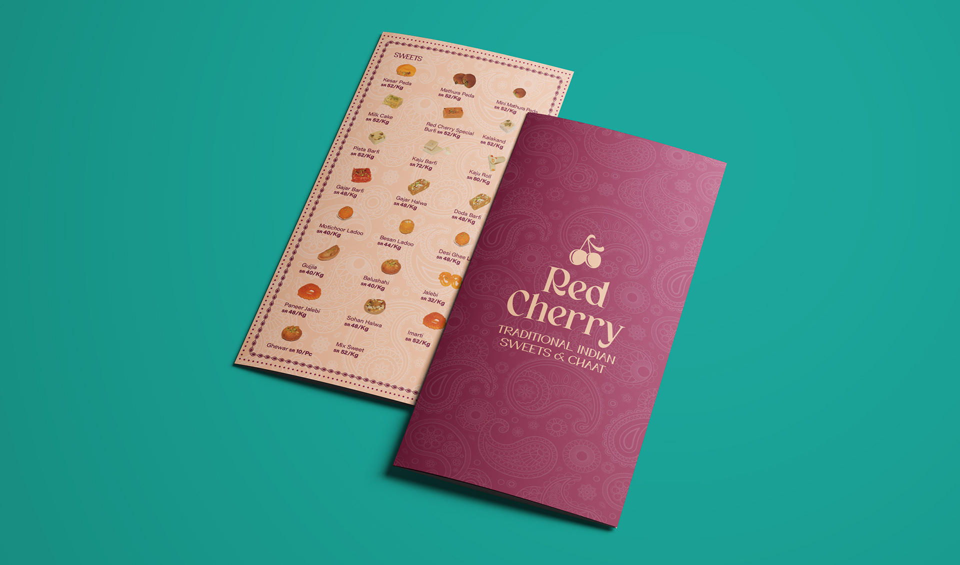
A lot of research went into capturing the spirit of the rich homeland without portraying any belonging to a specific creed.
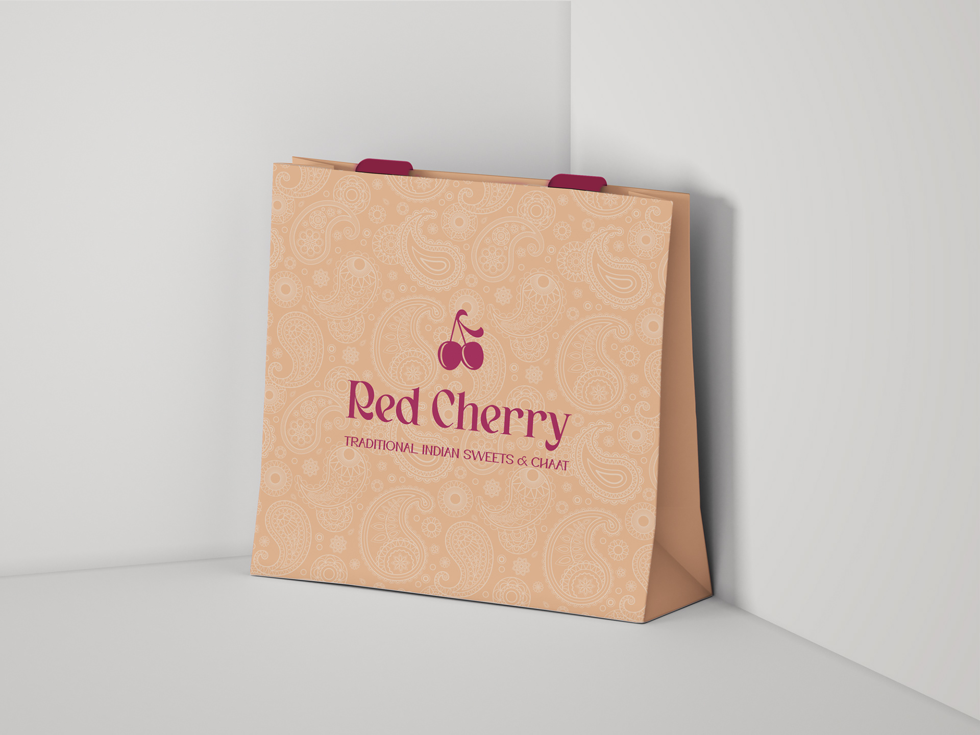
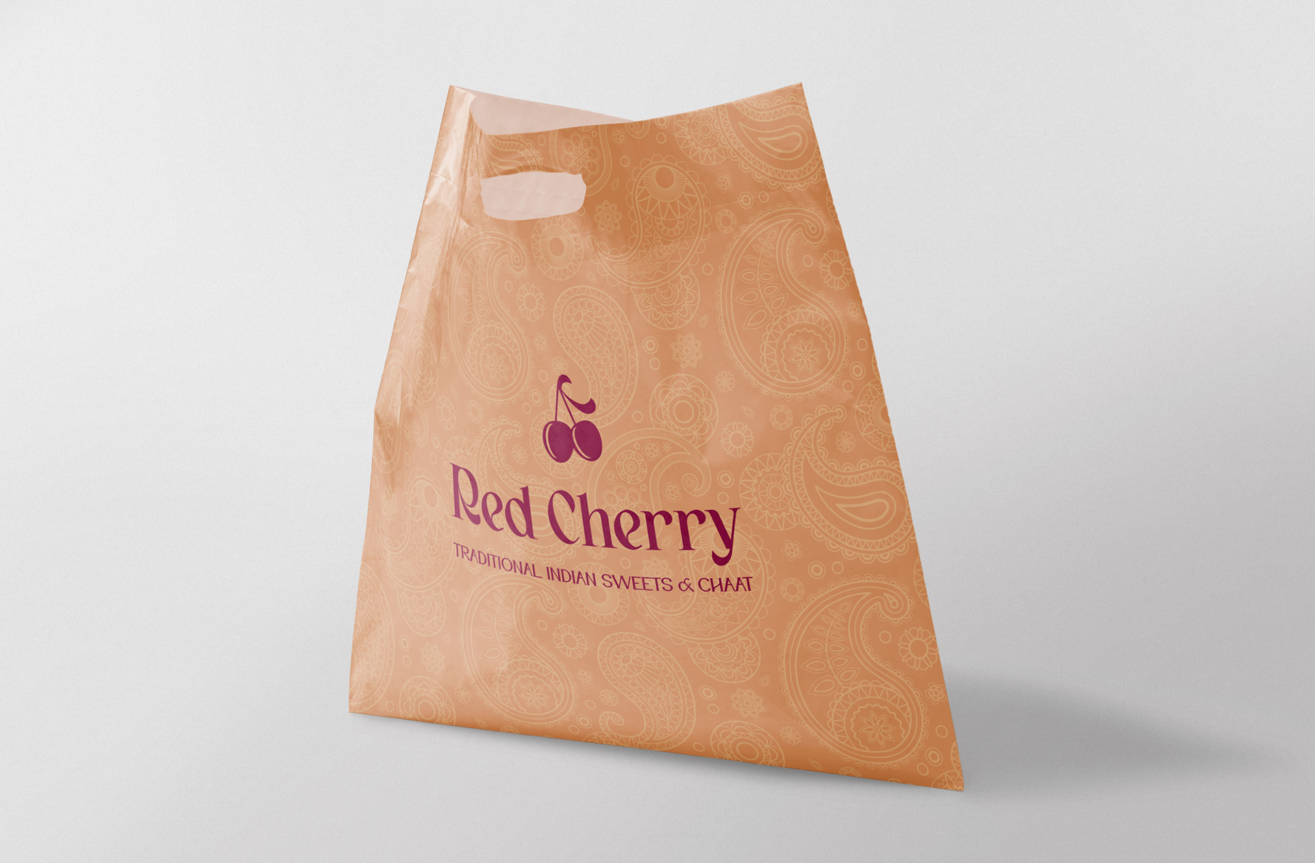
The brand was redesigned, keeping it simple and approachable, yet recognizable.
Shapes and patterns expanded the ineffable feeling of being in the heart of the Indian landscape that merges flora and architecture, while colors reflected the depth of spices and variety of tastes.
A lot of research went into capturing the spirit of the rich homeland without portraying any belonging to a specific creed.
The brand was redesigned, keeping it simple and approachable, yet recognizable.
Shapes and patterns expanded the ineffable feeling of being in the heart of the Indian landscape that merges flora and architecture, while colors reflected the depth of spices and variety of tastes.
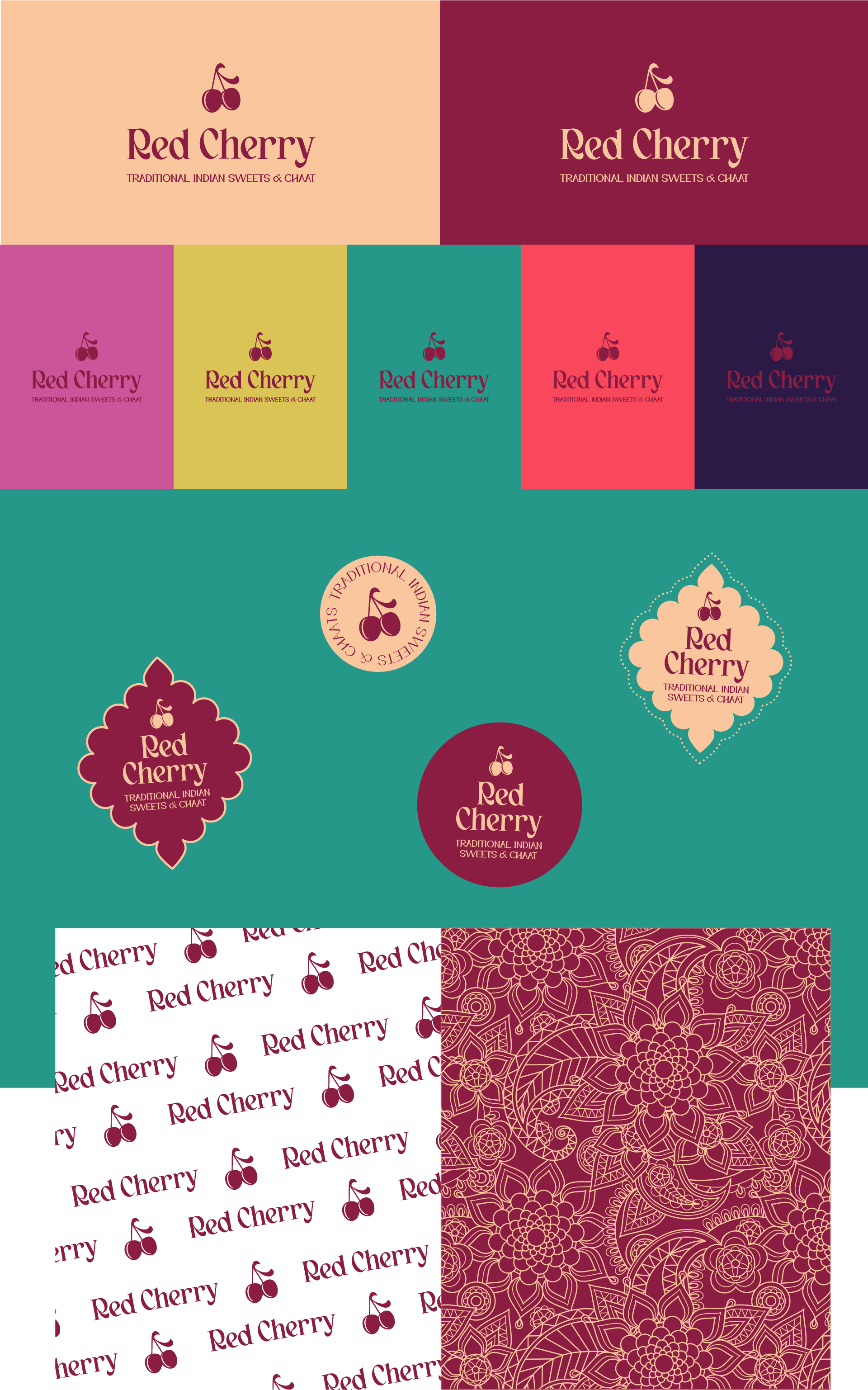
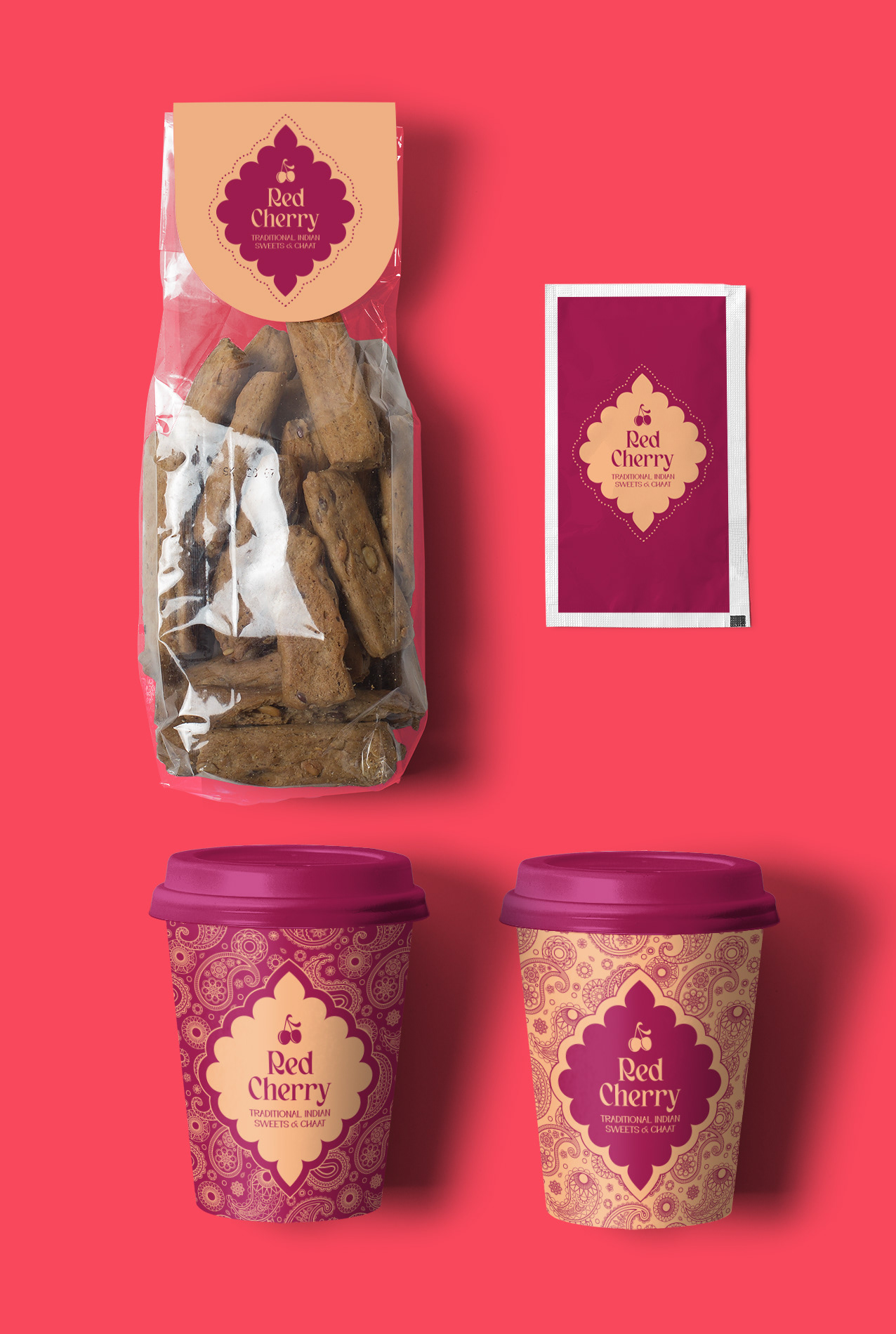
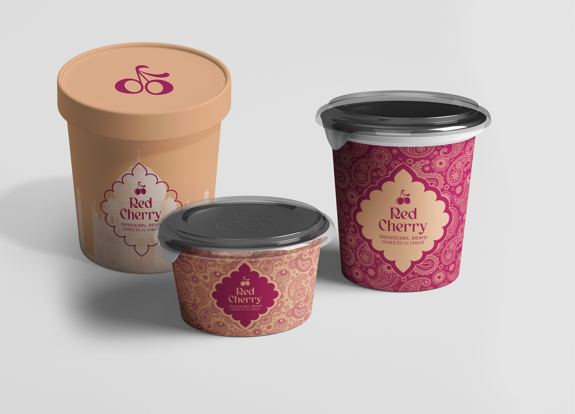
The packaging interplayed between day to day food orders that capitalized on flavors and an elevated gift box that puts the origins of the food at the centre of the story.