A PLAYFUL REBRAND FOR CROZY, A SAUDI ARABIAN BAKERY FAMOUS FOR ITS MINI FILLED CROISSANTS, TO EXECUTE A STRATEGIC BRAND REFRESH.
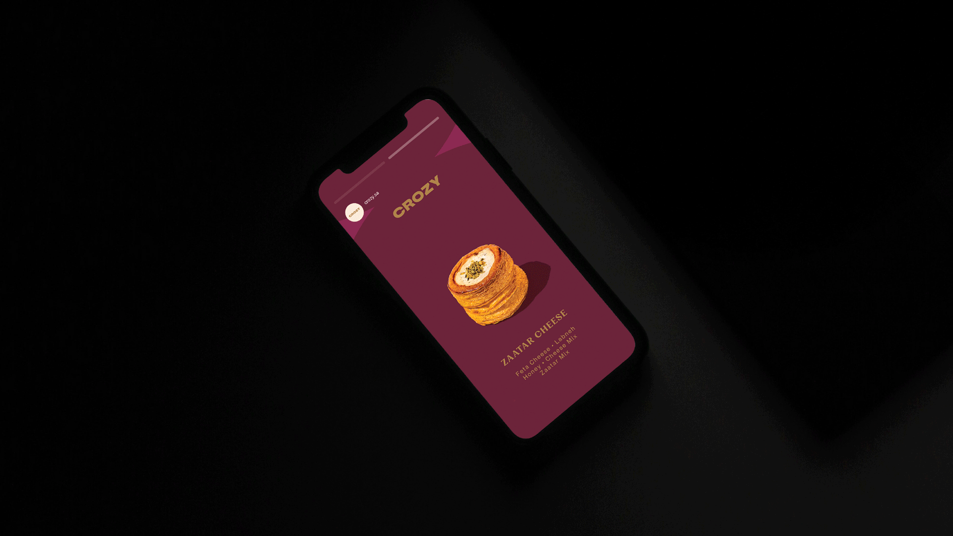
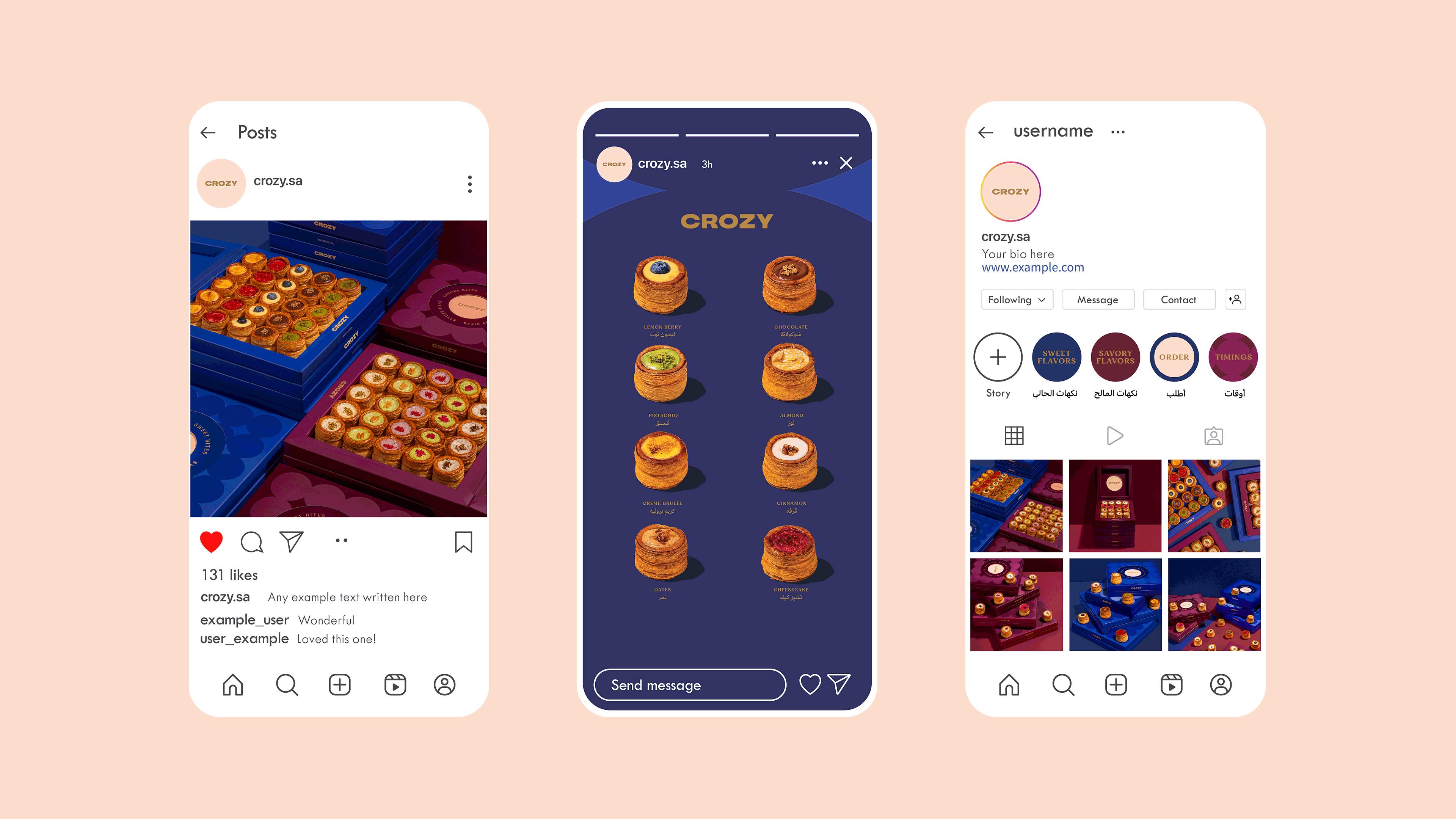
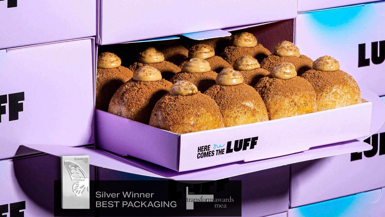
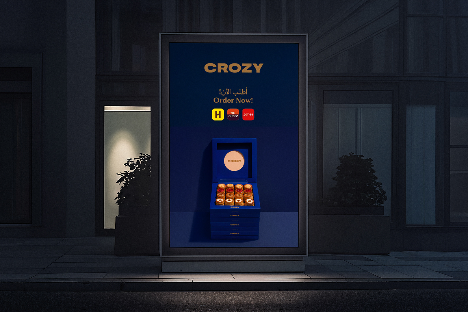
The goal was to distinguish their sweet and savory lines while elevating the overall customer brand experience. The branding introduced a color system; burgundy for savory, navy blue for sweet, and paired it with a playful circular pattern reflecting the product. The standout element is the custom, stackable box packaging, engineered to enhance the unboxing experience and position Crozy as the ultimate, shareable centerpiece for social gatherings across Saudi.
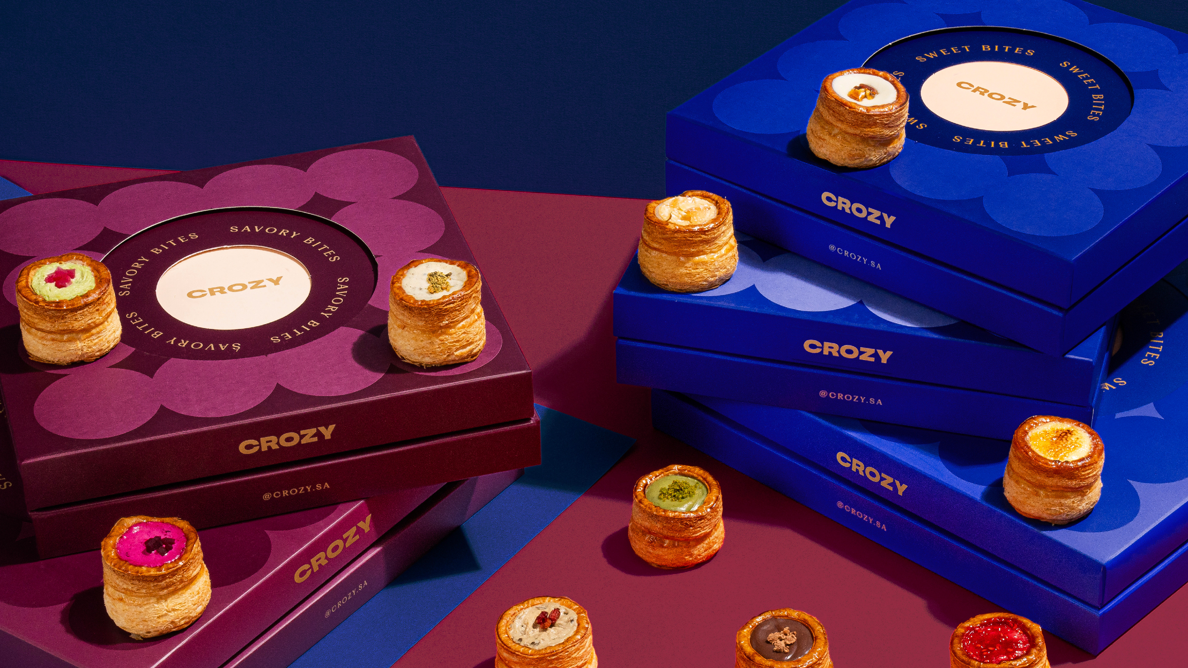
Crozy, known for its mini filled croissants, needed a refreshed identity to mark the launch of its sweet flavors and strengthen its overall brand experience. The challenge was to create a bold and cohesive look that distinguished sweet from savory while staying true to Crozy’s easy gourmet spirit. We introduced a color system using burgundy for savory and blue for sweet, paired with a layered box design that enhanced functionality and the unboxing experience. A playful circular pattern captured the brand’s refined yet fun personality, with the new identity rolled out across packaging, social media, and digital platforms to amplify the relaunch.
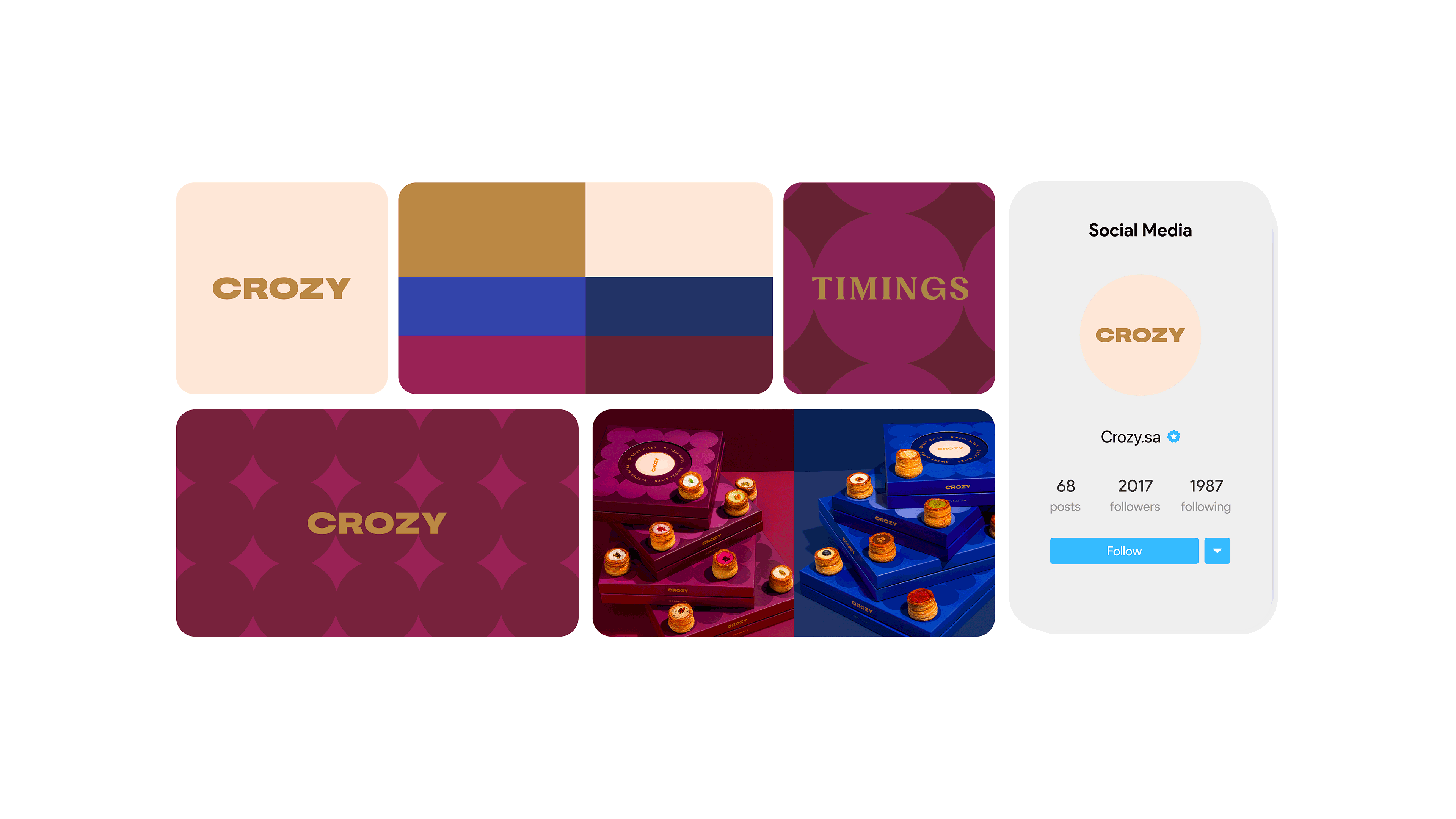
The Color System – A New Flavor Language
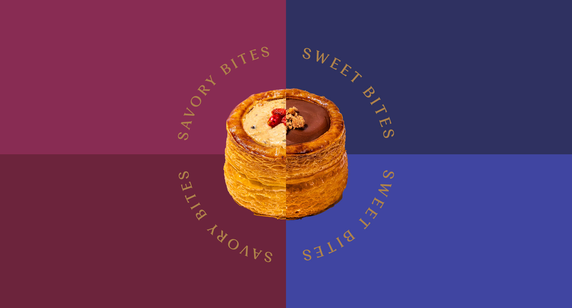
To create a clear visual distinction between Crozy’s two offerings, we introduced a strategic color-coded system:
Burgundy for Savory Bites: A deep, warm tone that conveys richness and indulgence, often seen in traditional bakeries and patisseries. This color reflects hearty, flavorful fillings and evokes a sense of depth and sophistication.
Navy Blue for Sweet Bites: A refined yet unexpected choice, giving Crozy’s sweet flavors a sense of modernity and distinction from the typical pastel tones used in dessert branding. It enhances the premium perception of the brand while maintaining a playful edge.
Navy Blue for Sweet Bites: A refined yet unexpected choice, giving Crozy’s sweet flavors a sense of modernity and distinction from the typical pastel tones used in dessert branding. It enhances the premium perception of the brand while maintaining a playful edge.
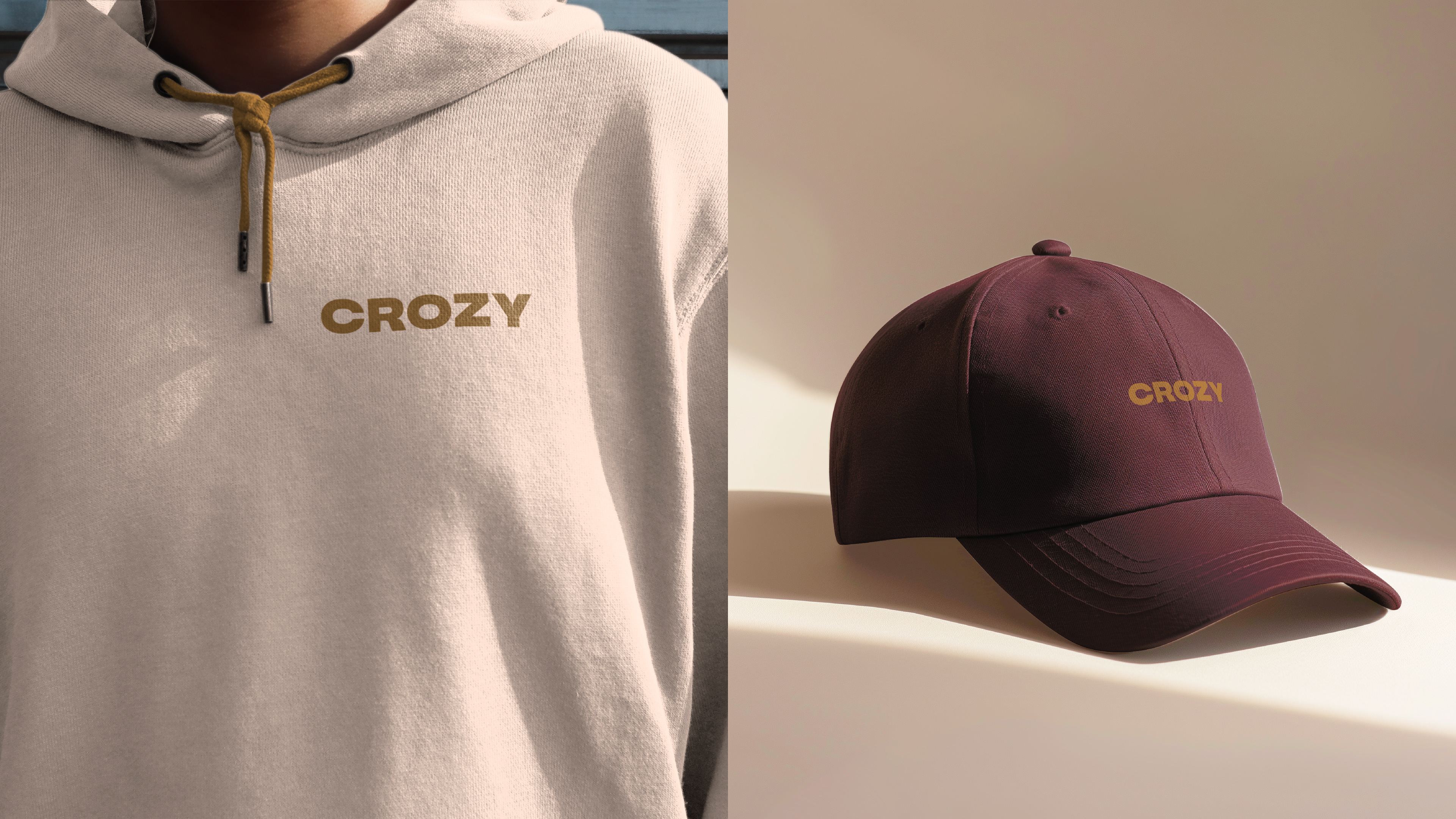
The soft curvatures in the Crozy logo subtly evoke the fluffiness and indulgence of its mini croissants, making the brand feel warm, inviting, and deliciously memorable.

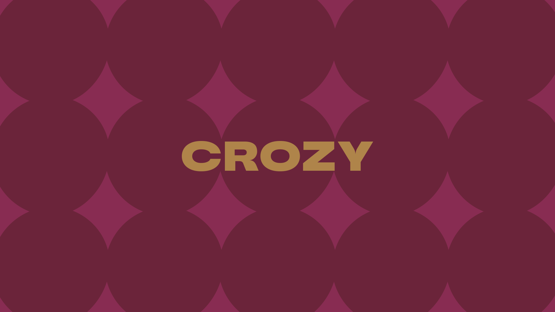
The circular pattern on the packaging was designed to reflect what’s inside—mini, round, bite-sized croissants that are meticulously layered. The repeating shapes not only add a sense of rhythm and movement but also create a visual cue for indulgence and shareability. The pattern serves as a subtle, yet effective storytelling device, reinforcing the layered craftsmanship of each Crozy bite.
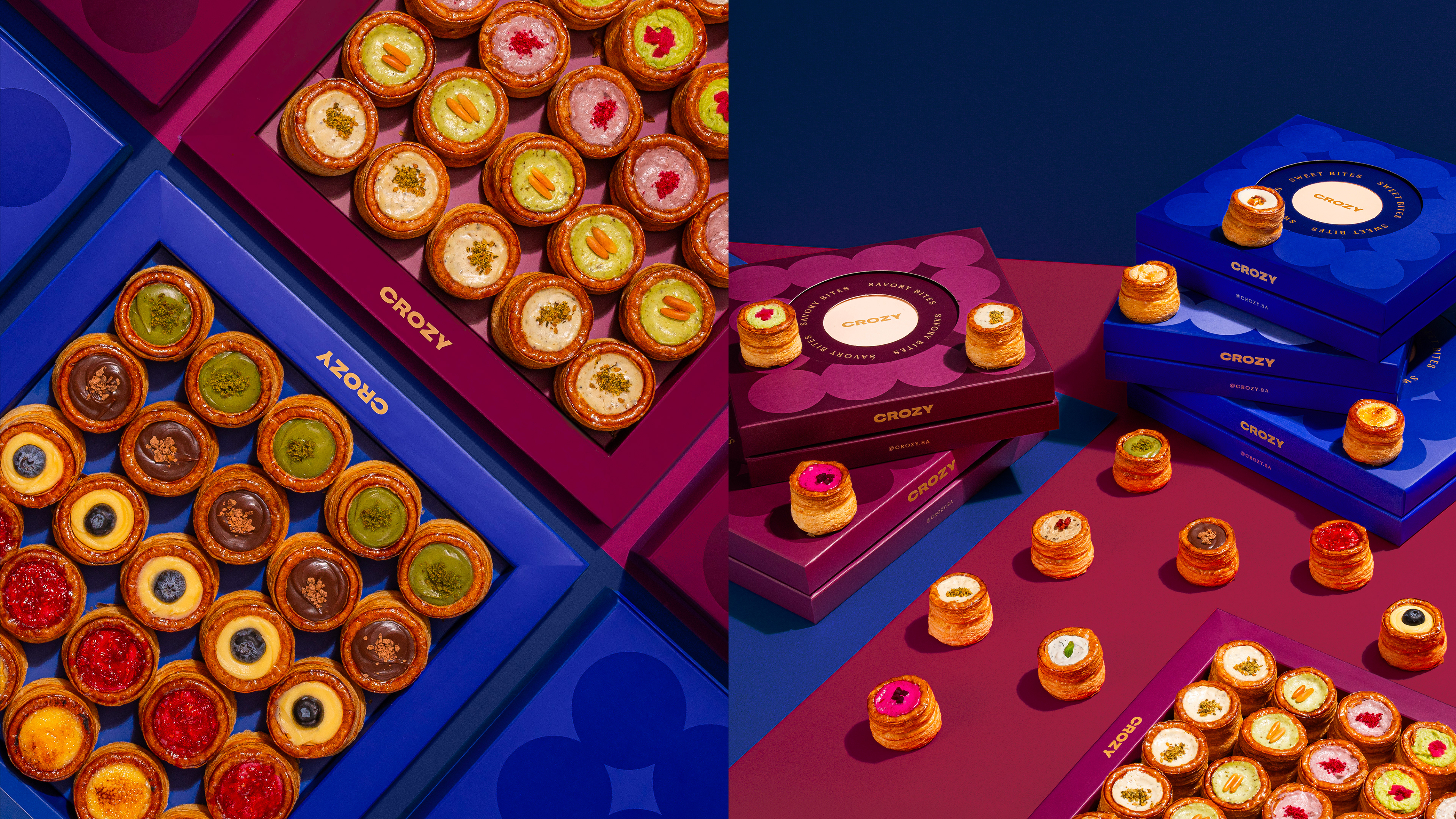
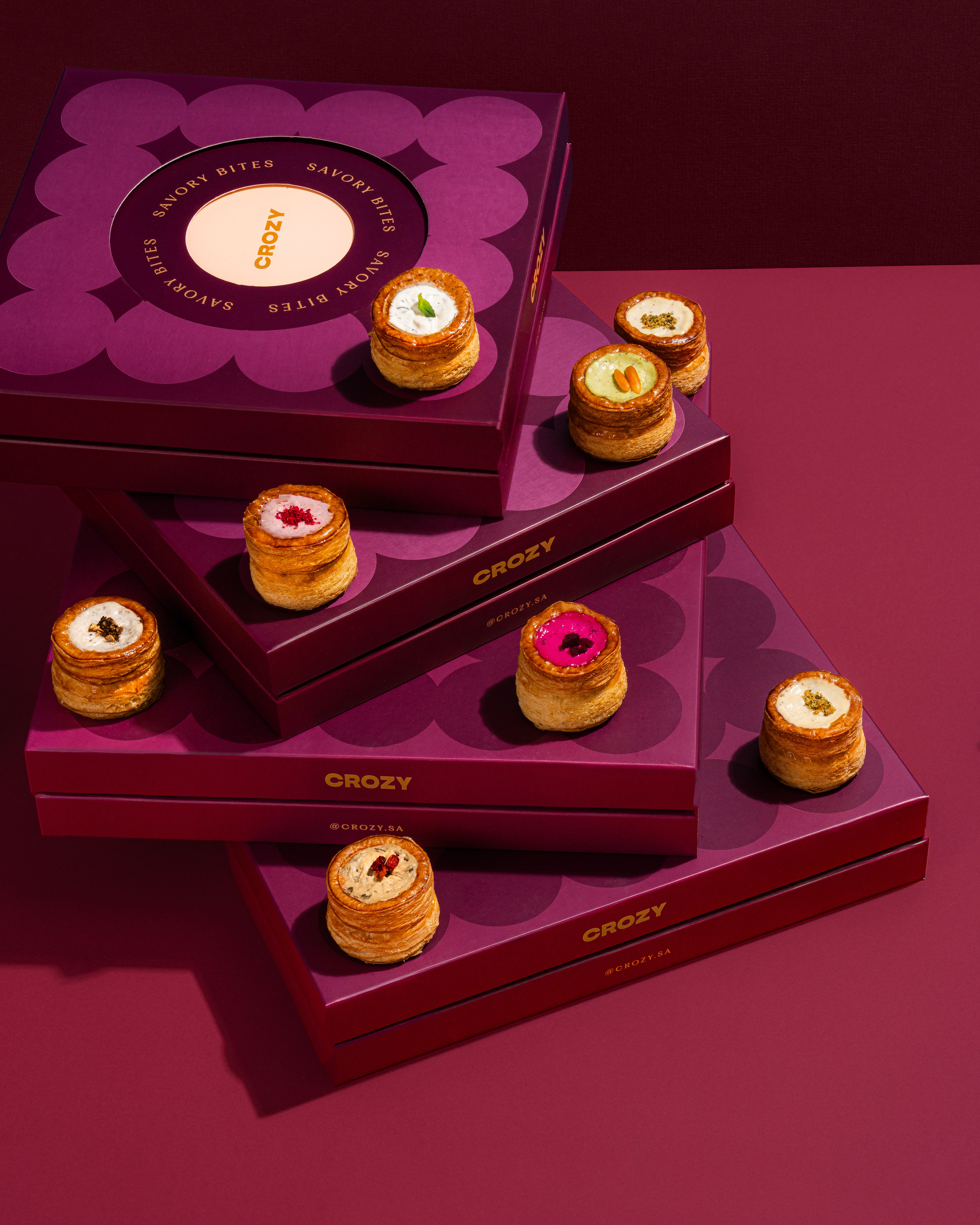
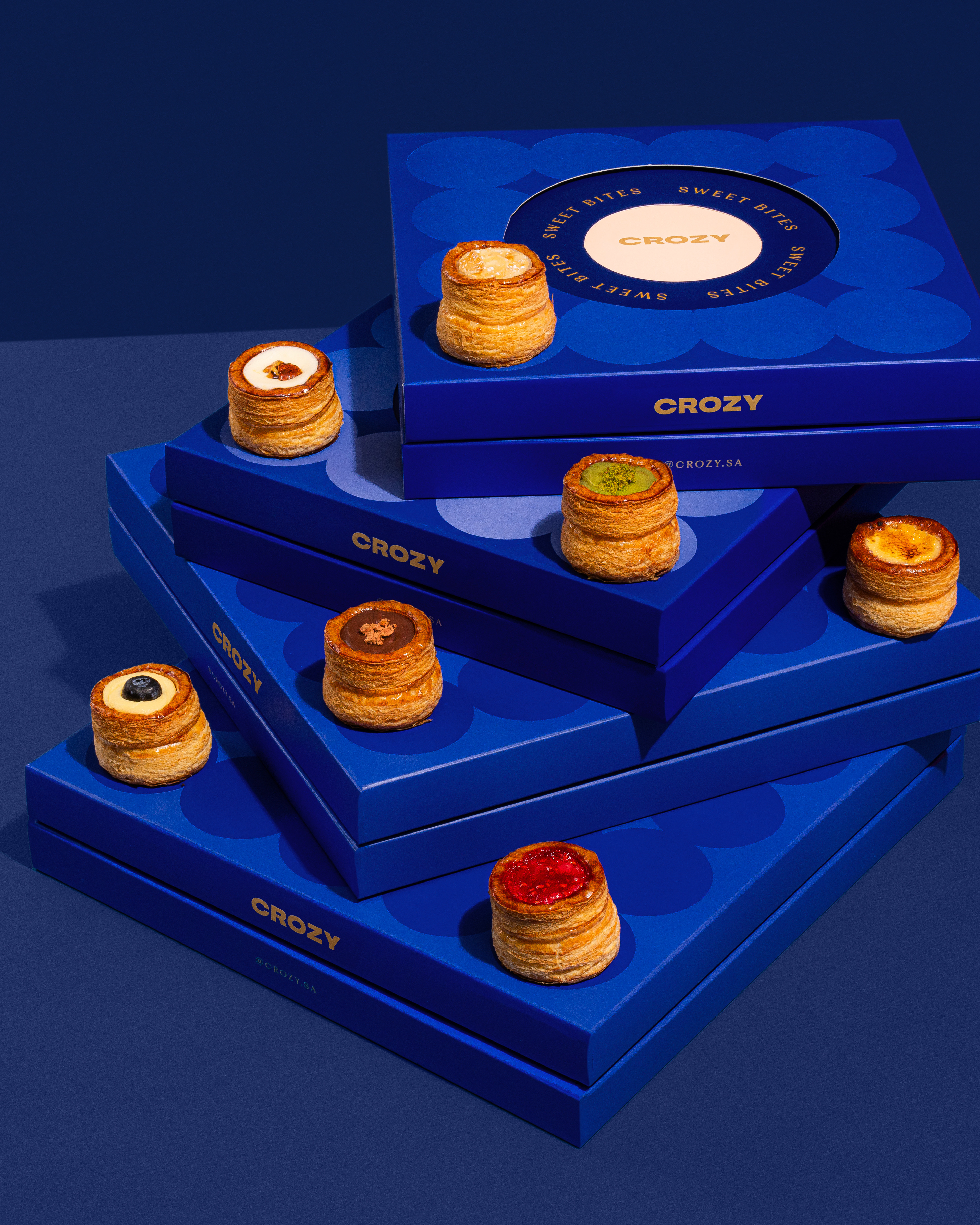
The stackable box system was designed to enhance the unboxing experience, making it visually striking while easy to transport and serve at gatherings. The layering effect adds a premium touch, reinforcing the idea that Crozy is more than just a treat—it’s a centerpiece for shared moments.
The new packaging and brand system successfully positioned Crozy as a modern yet familiar bakery experience, reinforcing its flavor variety, shareability, and sophisticated playfulness. The thoughtful color system, pattern design, and layered packaging come together to elevate the brand, ensuring Crozy is not only instantly recognizable but also memorable and functional for its audience.